The Furthest From The Floor
November 2014

Imagine a room without a roof, where the sky can be seen and the seasons read. This room holds the capacity to frame dazzling colour and scaleless formation, silent motion and subtle evolution.
What if a roof challenged these things, and set out to generate a drama quite of its own?
Often we witness the world at eye-level alone. Much of our urban landscape positively encourages us to do so. Yet it is sad if, on the occasion we raise our eyes to the ceiling, we are not enamoured with what we find. It is often height that offers the best opportunity for expression. With height comes volume and the potential to present the greatest manifestation of depth and structure.
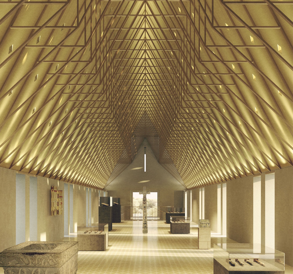
Our practice explores the roof and the complexity of a soffit as an ongoing theme. The notion of the exposed rafters in a barn has influenced the design of the soffit in our gallery at Auckland Castle. We are developing an array of rafters that create density yet delicacy in their mass when tightly multiplied. Though the roof is low, its lowest point occurs just higher than your fingertips, creating a definitive datum between the world of rafters and the world of exhibitions. This effect is further enhanced by the muted nature of the walls to increase the feeling of overhead awareness.
As contrast to this, your gaze is directed by the vertical piers that surround you as you move through Bishop Edward King Chapel in Oxford. Slowly they rise, higher and higher, until they meet the ceiling, at which point orientation is adjusted and the piers fuse with the weave of rafters. It is pleasurable to witness something simple become something complicated. Height offers the opportunity for elements in the space to take you on a journey. They “pick you up” at eye-level and carry you up to the roof, where often the brightest or darkest environments exist.
The requirement to defend from rain leaves the roof little choice but to protect, as efficiently and simply as possible, granting the interior more freedom for expression. And why not, when you consider where most building users will stand? However, as our towns and cities become denser, the roof, as seen from its surroundings, becomes an increasingly important issue to address.
The two examples I have given construct varying degrees of interest, leading me to suggest that it is possible for a roof to respond to that drama in the sky with a drama of its very own.
Katherine received a BSc Degree from the Bartlett in 2008. In 2007, she was awarded The Henry Herbert Bartlett Travel Scholarship and the UCL Expeditions & Travel Grant to conduct a construction project in Kampala. She joined Niall McLaughlin Architects in 2012 and has worked on London Academy of Music and Dramatic Art, St Cross College in Oxford, the T1 Argent Building in London and Jesus College in Cambridge.
The Red House
July 2014

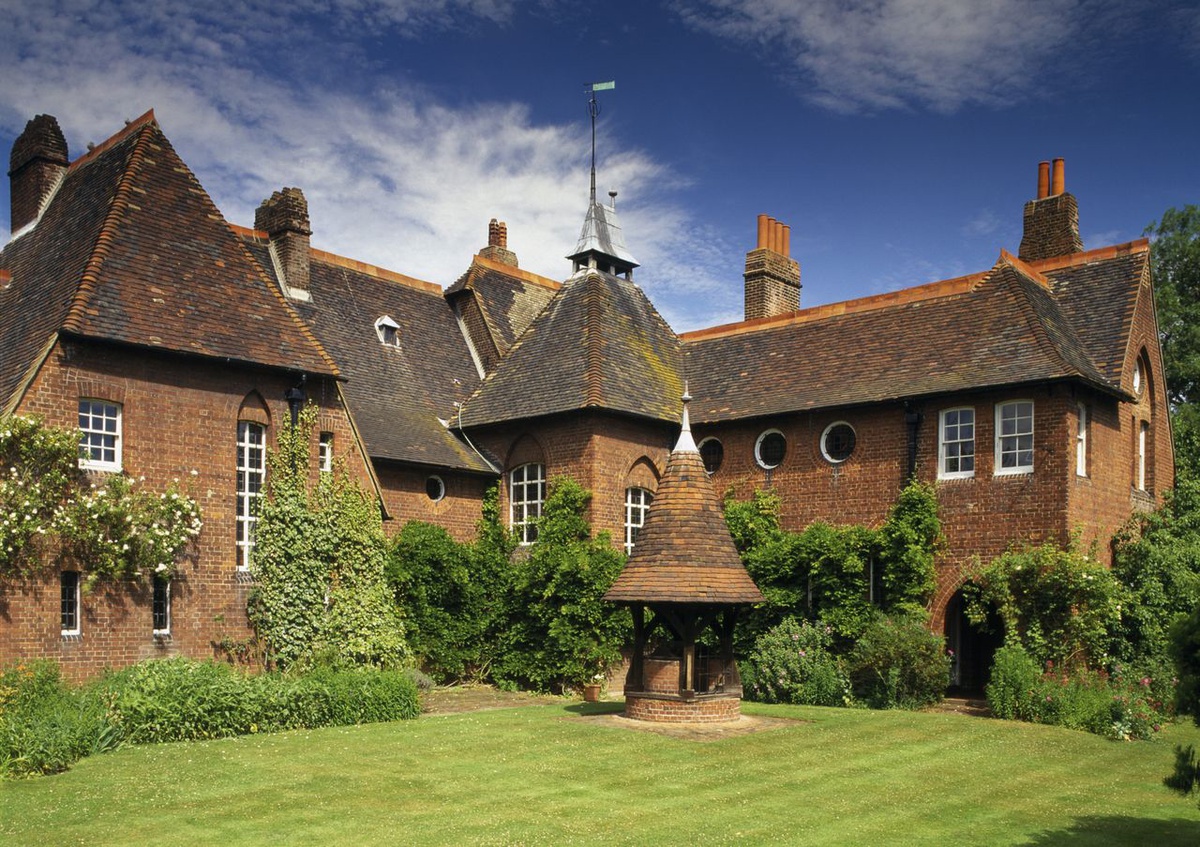
A group of us from the office recently went to visit William Morris’ Red House. I was inspired by a picture of a red house on the cover of Peter Davey’s book ‘Arts and Crafts Architecture’ so was slightly disappointed to find that those fine chimneys were the work of Edwin Lutyens and not Philip Webb. It was an interesting trip none the less.
The Red House was designed in 1859 by Philip Webb for William Morris. The two had met in the office of G.E. Street in 1856 during Morris’ brief architectural career. The house can be thought of as a bridge between the ‘Gothic Revival’ as epitomised by the ideals of Pugin and the ‘Arts and Crafts’. 50 years after its construction Lawrence Weaver wrote about The Red House ‘It stands for a new epoch of new ideals and practices. Though the French strain which touched so much of the work of the Gothic Revivalists is not absent, and the Gothic flavour itself is rather marked, every brick in it is a word in the history of modern architecture’.1
The Red House is something of an experiment, built by a young and relatively inexperienced architect, and as such is not a refined piece of architecture. Webb later remarked with reference to The Red House ‘…no architect ought to be allowed to build a house until he was 40’. 2
Despite Webb’s young age the experimental feel of the building is probably more to do with the client. Morris would have been incredibly ambitious and perhaps a little impractical. As our tour guide explained the principal rooms of the building face North to address ‘The Pilgrim’s Way’, an ancient route from Winchester to Canterbury as mentioned in Chaucer’s ‘The Canterbury Tales’. Our guide took great glee in explaining that this eccentricity led to the building being terribly cold, an example of Morris’ ideas overruling common sense. Peter Davey offers a simpler explanation in that Webb was following the Georgian fashion of the principle rooms facing North, whilst also allowing space for the connection of a future East wing for Morris’ friend Edward Burne-Jones and his wife Georgiana.3
To say that the Red House is unrefined, however, is to miss the point of what makes it so significant. It is the physical embodiment of a group of young designers and thinkers who went on to change the face of British art, design and architecture. They were inspired by a nostalgia of a reimagined medieval England, and it was in the past that they found the clues to pave the way for the Arts and Crafts.
This interest in an older England was not unique to Morris as Ian Hislop explains in his recently broadcast BB2 series ‘Ian Hislop’s Olden Days’, which places Morris’ aesthetic interest in the medieval into a broader social and political context. The description of the second episode, ‘Forward into the Past’ is as follows:
Forward into the Past – How the Victorians turned to the Middle Ages to make sense of their era of progress.
‘Ian Hislop travels back to the era of the Industrial Revolution and Victorian Britain. This was a time of some of the greatest progress and modernisation the country had ever seen – and yet, throughout these decades, writers, artists and politicians were trying to make sense of this new world by retreating into a very old world indeed: the Middle Ages.’
The point that Hislop makes is that we take comfort from the cultural signals that remind us of ‘the good old days’ weather they be the idea of chivalry, the Robin Hood politics of ‘take from the rich and give to the poor’ or the truth and beauty inherent in a gothic arch. For the Victorians the golden age was the medieval period so I wonder what it could be for us today.
In architecture we often talk about truth to materials and the expression of a building being honest to its construction. These ideas were central to the thinking of Morris and Webb’s predecessor, A.W.N. Pugin. In his book ‘The True Principles of Pointed or Christian Architecture’ he writes:
‘The two great rules for design are these: 1st, that there should be no features about a building that are not necessary for convenience, construction or propriety; 2nd, that all ornament should consist of the essential construction of the building. The neglect of these two rules is the cause of all the bad architecture of the present time.’
These words seem as relevant today as they were when first written, although our mental picture on reading them may be somewhat different. Perhaps Pugin’s time and the generation that followed could be thought of as an architectural golden age. In architecture school the Victorian period is an interesting piece of history but not relevant to modern design, but might it be ok to take some inspiration from these great designers?
The idea of any given moment in time looking back to a golden age reminds me of the plot of Woody Allen’s film ‘Midnight in Paris’ which Wikipedia notes ‘The movie explores themes of nostalgia and modernism’
Gil Pender travels back to his Golden age, 1920’s Paris where he socialises with the likes of Hemmingway and falls in love with the beautiful Adriana. All’s well until they are transported back to Adriana’s golden age, the 1890s Belle Époque and Pender realises that a golden age can only ever exist in the past.
If time travel were possible we would only ever be chasing rainbows.
When we build in an historic environment or we are looking to create a sense of place we turn to local materials and traditional construction techniques. These offer us a connection with the past that is important for reasons that I can’t begin to explain but which I acknowledge as being real and significant.
It seems to be becoming increasingly acceptable within contemporary architecture to address issues of nostalgia and modernism but our recent brush with post-modernism has made us cautious in our approach. As we venture once more in this direction we would do well to remember the lessons of Pugin, Allen and Hislop.
1. Weaver, Lawrence Small Country Houses of Today, First Series, Country Life, London, nd, p180.
2. Jack, George ‘An appreciation of Philip Webb’, The Architectural Review, Vol XXXVIII, 1915, p3.
3. Davey, Peter Arts and Crafts Architecture, Phaidon, 2010, p40.
Tom studied at the University of Manchester where he received a BA (Hons) and a diploma with Distinction at the Glasgow School of Art. He won the Royal Scottish Academy Student Prize for Architecture in 2006 as well as the Glasgow City Council Silver Medal, Glasgow School of Art Chairman’s Medal and Glasgow Institute of Architects’ Parchment. Between 2006 and 2013 he worked for Duggan Morris Architects and Rick Mather Architects. Tom joined Niall McLaughlin in 2014 and has been working on a private house in Hampshire and is currently running the Jesus College project for the master plan and first phase of development to add research, social, academic and residential accommodation to the College facilities.

